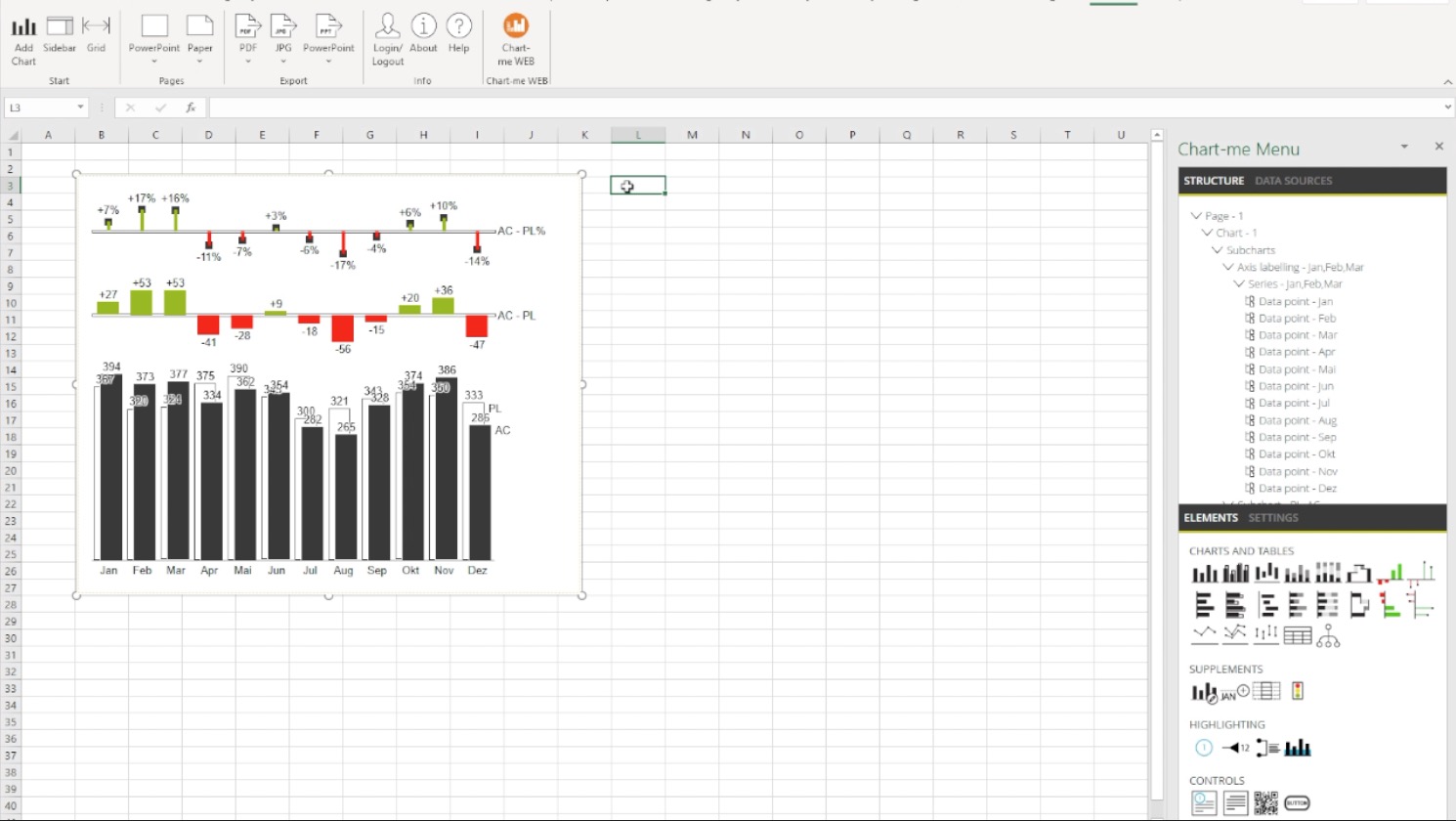
the new hi-chart  AddIn for Excel

for MS Excel from 2019 and 365

Produkte-hi-chart Excel

Video – two minutes

video
play-sharp-fill

that’s how it works:

1. Insert hi-chart graphic directly into Excel

hi-chart Excel
2. Select chart type or table

3. Create cell range for input

4. The data can be changed as usual in Excel.

5. An existing cell range can also be selected

6. Changes – even more or fewer rows and columns – are updated immediately

7. Subcharts can be dragged from the sidebar

8. Scenarios such as ACTUAL, PLAN or FORECAST are automatically detected

9. Several charts can be combined

10. Cell areas of SAP Analysis For Office are also automatically detected

11.hi-chart graphics can easily be combined with other Excel objects.

hi-chart Excel

tutorial videos

how to install hi-chart excel
video
play-sharp-fill

Features

Basics
  • Reports, presentations, and dynamic dashboards can be created using Hichert-IBCS charts and tables.
  • Chart-me charts and tables can be linked to Excel cell ranges. SAP Analytics For Excel cell ranges are also detected automatically.
  • These basic types are available:
    • Unstacked columns and bars
    • Scatter (point) and line charts
    • Stacked columns and bars
    • 100% stack
    • Waterfalls
    • Tables
    • Deviation chart types
    • Columns and bars for delta deviations
    • Waterfall columns and bars for cumulative deviations
    • Needle chart type for percent deviations
  • Charts and tables can be supplemented generically with any number of subcharts, data series and table columns.
  • Tables can also be supplemented with charts as deviation columns.
  • Charts can also be copied via the Windows clipboard and pasted elsewhere.
  • Chart-me object properties can be edited in a properties dialog.
  • All objects, such as pages, charts, subcharts, rows, columns, data points, highlights, … are displayed in a structure tree and can be selected there.
Unified visualization
  • Scenarios (AC, PL, FC) according to IBCS are integrated and applicable to data series and axes.
  • Previous years are presented brighter.
  • Headings can be displayed in standard widths for period types (years, quarters, months, …) or in user-defined widths.
Highlighting
  • Highlighting is available to focus the presentation, such as
    • Difference indicator,
    • Value indicator,
    • Scaling indicator,
    • Commentary references as well
    • custom colors for columns, bars, lines, points, and labels.
Scaling
  • Common scaling can be easily implemented with scaling groups and scaling indicators.
  • A distinction is made between different measures that are commonly scaled.
  • Due to the font size concept, the display can be scaled larger or smaller only by changing the font size.
  • Labels can be separated into measures (values, volumes, shares) in thousands, millions, billions.
Hierarchies
  • Multi-nested hierarchies for tables and charts (waterfalls) are possible..
  • Drilldowns in charts and tables are possible.
  • Hierarchies can be modeled freely as parent-child relationships.
Daten
  • Daten werden so dargestellt, wie sie in den Excel-Zellen angeordnet werden.
  • Es können auch Datenquellen zu externen Systemen definiert werden, die nicht im Zellbereich abgebildet sind. Das kann SAP BW oder IBM Cognos TM1 sein.
Dynamik
  • Objekte können dynamisch ineinander überführt werden, z.B.
    • Horizontale Achse (Zeit) in vertikale Achse (Struktur),
    • Diagramme in Tabellen,
    • Absolut- in Prozentabweichungen,
    • Szenarien (AC, PL, FC) können gewechselt werden,
    • Beschriftungen können ein- oder ausgeblendet werden
  • Die Anzahl Unterdiagramme, Datenreihen und Rubriken kann dynamisch durch die Elemente einer Dimension angepasst werden.
Interactivity
  • Definable click interactivity for interactive dashboard solutions.
  • Rows, columns, charts, subdiagrams, data points, and axis labels can all be defined as clickable and highlighted during hovering.
  • Click event handling can be programmed with scripting.
Scripting
  • Integrated full Javascript scripting.
  • Scripting editor with intellisense, text completion and parameter display.
  • The entire object hierarchy of the charts and tables can be controlled by scripting.
  • Objects can be dynamically interlaced by scripting, e.g.
    • Horizontal axis (time) in vertical axis (structure),
    • Charts in tables,
    • Absolute in percentage deviations,
    • Scenarios (AC, PL, FC) can be changed,
    • Labels can be shown or hidden.
Export
  • These formats can be exported:
    • JPEG images,
    • PDF files and
    • PowerPoint presentations.
  • All exports have an impressively high graphic (ready-to-print) quality.
    Here are examples:

Cooperation
  • With Chart-me projects can be exchanged between different platforms.
  • The exchange is easy via the clipboard or as a file.
  • Charts and pages can be exchanged between Chart-me projects in Excel, Web and SAP Lumira.

Technology and system requirements

System requirements

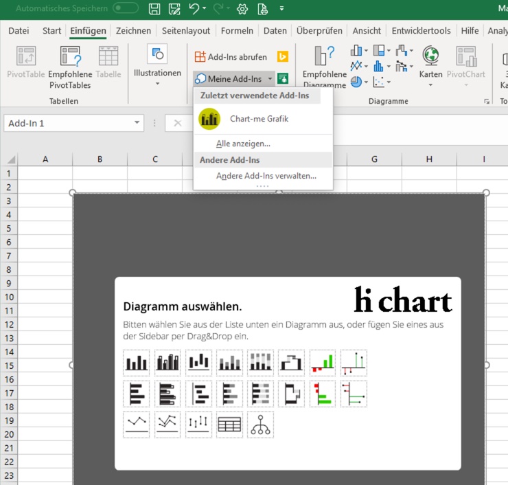
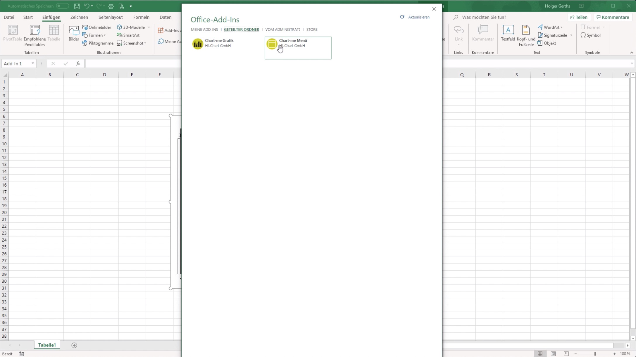
Excel 2019 or Excel from Office 365 for Windows or Mac, Excel 2016 with limited functionality.

Technologie

Chart-me Excel runs as Office Web Add-In. The graphics and menus are web pages that are loaded by a web server. User-defined data and projects are never sent to the web server.

TRY OUT HI-CHART NOW FOR FREE!

With no obligation