Tutorials
01 Basics and Data Preparation
02 Create Hierarchies
03 Waterfall Variances
FAQ
All/Chart/Chart-Multipliers/Comments/Data filters/Data sources/Data sources-Filters/General/Insert/Project/Settings/Stacked chart/
Can an entered command be undone?
The undo redo function, which is operated with the two arrows, is located in the main menu on the upper left.
How to save a project?
You can save projects to the server by clicking on the button “Project is not saved”, which is located in the middle of the menu list. Another option is the main menu at the top left: Project – Save.
Under Project Properties - Share, you can share the current project with the "Public with login" permission. However, the list from which the authorized agents could be selected is empty and no selection is possible.
For the setting “Public with login” you have to be with other users in a common user group. The user groups with their respective members and authorizations are created by the administrator in the admin interface.
When is a normal and when a 100% stack chart is used?
A normal stack chart shows the summation of different values in data series.
A 100% stack chart shows the percentage distribution of different rows and the sum is 100%.
How to select a data point in a chart?
Click once on the corresponding data point.
How to select a row in a chart?
Double-click or click the right mouse button on any data point of the category to be selected.
How to select a category in a chart?
Click with the right mouse button on any data point of the category to be selected.
How to change the order of table columns, data series, and sub charts?
Table columns as well as variance charts are sub charts and can be moved in the structure view using drag & drop. For a better overview it is recommended to move the sub charts in the collapsed state.
How to change the display order in the stacked or grouped time series chart?
Select the series to be moved in the structure view and drag and drop it to the desired position.
Where can the different colorings of the columns or bars be set if they are not controlled by the property AC, PL or FC?
These settings are specified by the selected stylesheet. Changes to the stylesheet can only be made by an administrator.
After assigning your own data by drag & drop, the objects are not displayed correctly; For example, only one of the existing data series is displayed in a stacked time series chart
- Switch the Dynamic switch to ON before inserting a chart
- Check the chart property „Multipliers“
The multiplier is set for the entire chart in Settings – Data. This sets how objects such as sub charts, data series, or charts (in a future version) are multiplied by the elements of a given dimension.
The title label (in Chart – Settings Labelling) protrudes into the display area of the chart / table shown below. How can you proceed here to allow a distance between the labelling and the chart?
These labels are on a fixed position on the page. In order to allow a distance between the title and charts or tables, you can adjust the margins and paddings under Chart – Settings – Position.
How can you make differently sized charts to be displayed on a report page as commonly scaled?
The report page is designed in a way that the displayed objects optimally use the available space. Thus, different value measures are displayed with the same size. To display two or more objects in the same scale, they must be assigned to the same scaling group. The settings are made for the chart in Settings – General.
Do the report data leave the company network?
No. In production, hi-chart is installed on a server of your company.
This keeps all data in the company and the generated reports are accessible from the intranet.
External access, for example, for mobile reporting are possible without problems, but must be enabled by your IT.
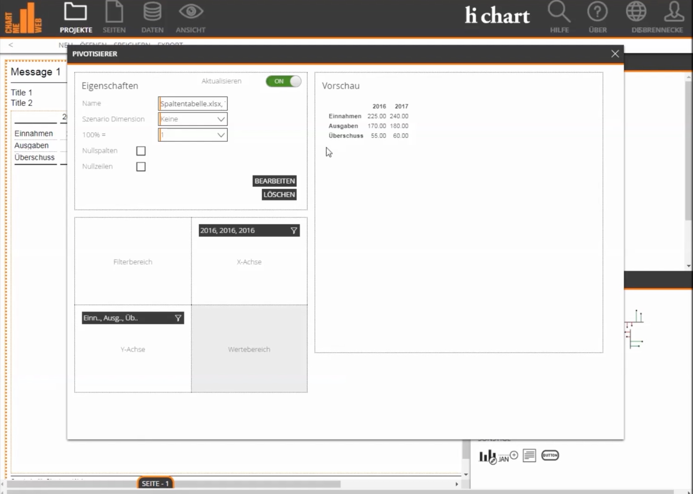
After inserting a separate data source, the scenarios AC, PY, PL, etc. recognized in the data source as column header are not displayed as labels in the axis.
By default, the scenario dimension (PY, AC, PL, FC) is not visible. Changes are possible in the pivotizer editing dialog of the respective data source. All dimensions in the data source are listed here and can be edited after clicking on the icon.
When you insert your own data source via the side menu, only the file format csv is available as a selection option and not an Excel file.
Check whether there is an Internet connection because Excel files must be uploaded to the server. CSV files are stored locally in the hi-chart project.
When you create your own data source, the column headers are not recognized as headers.
In the second dialog when creating a data source, it is important to select whether the source is a pivot table with dimensions in rows and columns, or a fact table that has only column dimensions.
When you insert your own data source, zeros are displayed in some cells, but a non-zero value is displayed in Excel.
Not all Excel formulas are understood by the Chart-me formula interpreter. Try to enter a fixed value in Excel instead of the formula at the same point.
When opening a project, not all of the data in a data source is displayed
It is possible that a filter is set in this data source and prevents the display of certain data records. Global filter settings are kept when the project is closed.
When you add a user filter, not all records of a data source are available as a selection
It is possible that a filter is set in this data source and prevents the display of certain data records. The user filter has a subordinate dependency on the filter of the data source.
When filtering data, comments remain on the report page, even though the dimension to which the comments are linked are filtered out and no longer displayed
The comments that are kept when you filter the appropriate dimension on the report page have been added as non-object comments. Positioning on the object can be set in the comments settings in the Data section later, or the comment reference (number in the circle) is moved over a data point.
What does "file" or "server" mean when opening and saving files?
With hi-chart we work in the web browser. Here you cannot open a file, leave it open and then save it. In a browser you can upload a file to open and download to save. For security reasons, a browser has very limited access to the file system. Saving files is only intended to transfer projects to another server or to another platform, e.g. into SAP Design Studio.
Open and save on the server
This is the standard for normal work. The project is stored in the hi-chart database and reopened from there.
What does project save as "copy"?
A project always has a unique project id that is not visible in the user interface. If you want to rename a project, you change the name in the user interface. A new project id is generated with a “Save as a copy” (in file or on the server). This has the same meaning as “Save as” for desktop application. The server then creates a copy of the project. Saving to a file “as a copy “means that reopening and then saving it on the server would not overwrite the source project (with a different id) on the server. In other words, a project stored on the server and stored as a file (not as a copy) retains its project id. If you open this file and save it on the server, the project on the server will be overwritten.
Quick Start and Manuals
Manuals


Quick Start
hi-chart INSTRUCTIONS
FROM THE BEGINNER TO THE PROFESSIONAL
For beginners:
Get to know the use of hi-chart in a few steps. You create a figure in a few minutes, adapt it to your needs, link it to a data source and share the result via e-mail link or PDF file with others.
Manual
hi-chart
User Guide
A reference book in which all the functions of hi-chart are clearly listed and illustrated with pictures.
Manual
hi-chart
Scripting Guide
hi-chart and hi-chart DS can be automated and extended by a powerful JavaScript interface. The scripting manual serves as a reference for almost all scripting functions.
Manual
hic-hart
Installation manual
The installation manual explains the installation on a Web server.
Changelog
January 2018 - Version 2.5
- PowerPoint export with customizable slide masters is possible
- Data sources can be exported as Excel CSV
- Tables with text instead of numbers as values are possible
- Table headers in subdiagrams can be automatically aligned
- Highlighting (e.g., ellipses) are anchored to the data coordinate
- Balanced Scorecard graphics with traffic light colors are possible
- Horizontal axis in tables with row hierarchies can be expanded and collapsed with + – characters
September 2017 - Version 2.4
- Automatic multicharts can be created with the chart multiplier. Here is a video.
- The Dynamic switch (switch top right) is no longer available. This is now solved via the multiplicators of the chart object (see video). The multipliers are on the chart object under Settings – Data.
- Graphics are now made of pure html, without SVG. This makes the performance much better and the images are sharper.
- Scaling groups now work across the entire project and not just on one page
- Multiple charts can be grouped into axis position groups so that the alignment of the X axes is synchronous.
- The page layout can now be made visible with grid lines.
- The highlighting of selected elements is clearer (orange frame)
- With the designer interface, drag-and-drop also works with gestures on mobile devices. It is nice if you can make a demo with the tablet.
- Settings of an object are no longer stored with the full data coordinate (drilldown with X axis, Y axis, filter), but only with X axis and Y axis. If, for example, a value is formatted bold in a table, this formatting is retained for all filter states.
- The scenario dimension can now be selected correctly in the data source
- The view zoom is retained during processing steps
December 2016 - Version 2.2
- Changes that affect the chart me DS version
September 2016 - Version 2.1
- Tooltips for displaying data and coordinates on chart elements
- Script function for downloading PDF, PNG, JPG, CSV
- New chart type 100% stack
- Optional displayable value axes
June 2016 Version 2.0
- Click events for custom interactivity in dashboards
- SAP BW hierarchies are recognized automatically
- Multiple hierarchies can be nested in a chart or table
- Waterfalls are automatically formed based on the hierarchies
hi-chart
NEWSLETTER REGISTRATION
[hubspot type=form portal=19954785 id=18817a4c-075b-44a8-9f66-c4d595738f03]
 Twitter
 Xing
Xing YouTube