Instant-Reports
Instant reports are ready-to-use Excel templates for reports and presentations. The professional sample images correspond to the high quality requirements of the SUCCESS concept of Prof. Dr. Hichert.
Instant reports are ready-to-use Excel templates for reports and presentations. The professional sample images correspond to the high quality requirements of the SUCCESS concept of Prof. Dr. Hichert.
They are an ideal addition to Chart-me XLS. This way, excellent results can be presented in just a few minutes. Chart-me XLS users also learn many valuable details for creating their own figures.

In combination with Chart-me XLS, instant reports can be customized. For example, you can add additional bars, change the position and size of the charts, adjust colors, hide and show labels, control scaling functions, and much more. All page layouts fit pixel-pixel accurate in PowerPoint slides as usual.

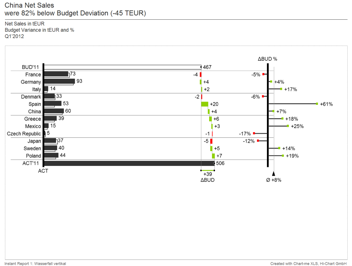
The vertical waterfall is a form of structural analysis.
It is used here for the transition between the reference values “BUD” and “ACT”. The intermediate steps in this example are countries, but it can also be products, divisions, projects, cost centers or cost types. In addition, a needle chart illustrates the percentage variance per country. This chart shows clearly how the individual countries contributed to the overall plan variance.
……………………..

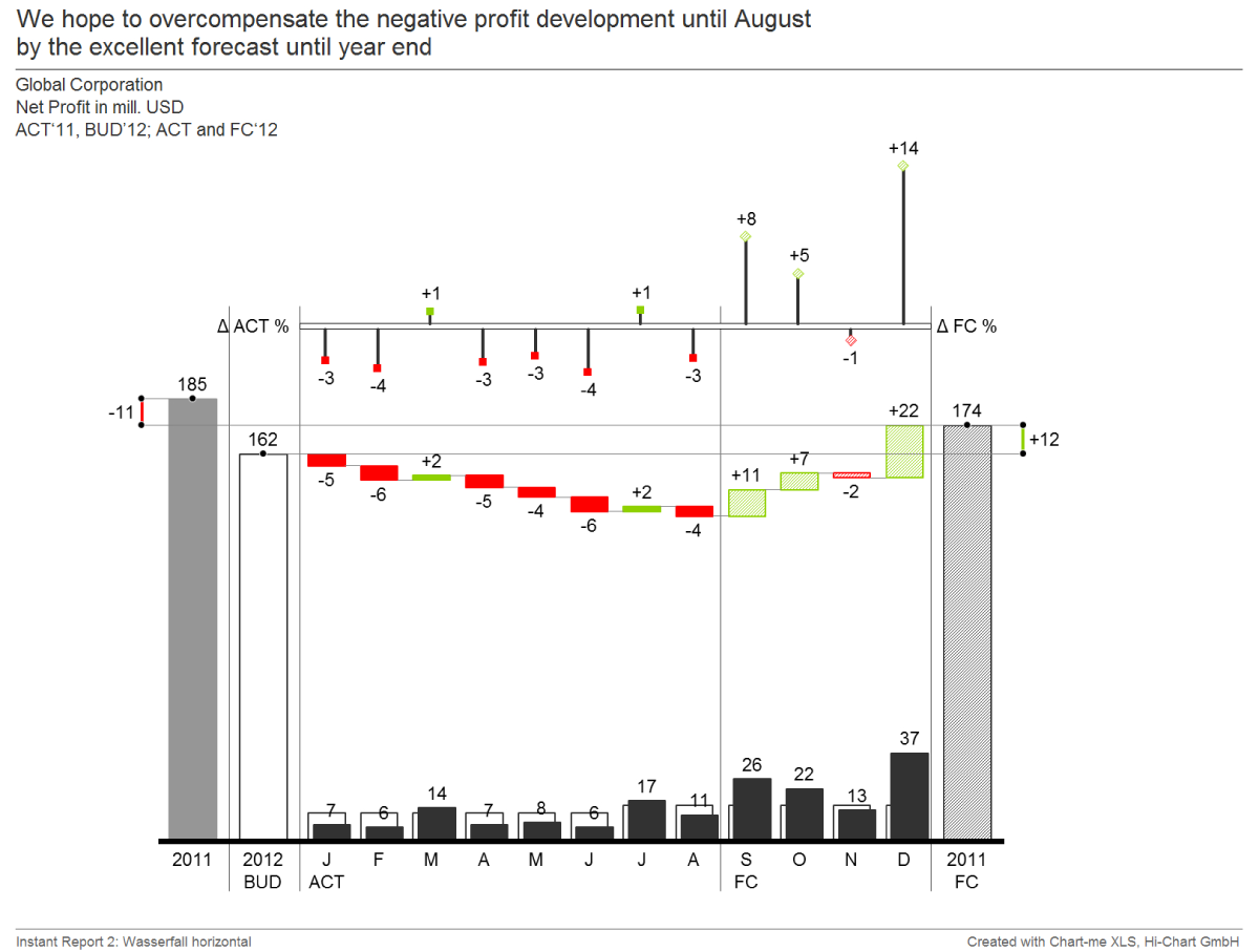
The horizontal waterfall is a form of time series analysis.
In this example, Previous Year, Plan, and Forecast are compared. The intermediate steps show how the individual months affected or changed the actual plan variance. A needle chart illustrates the percentage variance per month. This business chart is also suitable for visualizing the development of stock variables from a start value to a final value, for example for receivables or loans.
……………………..

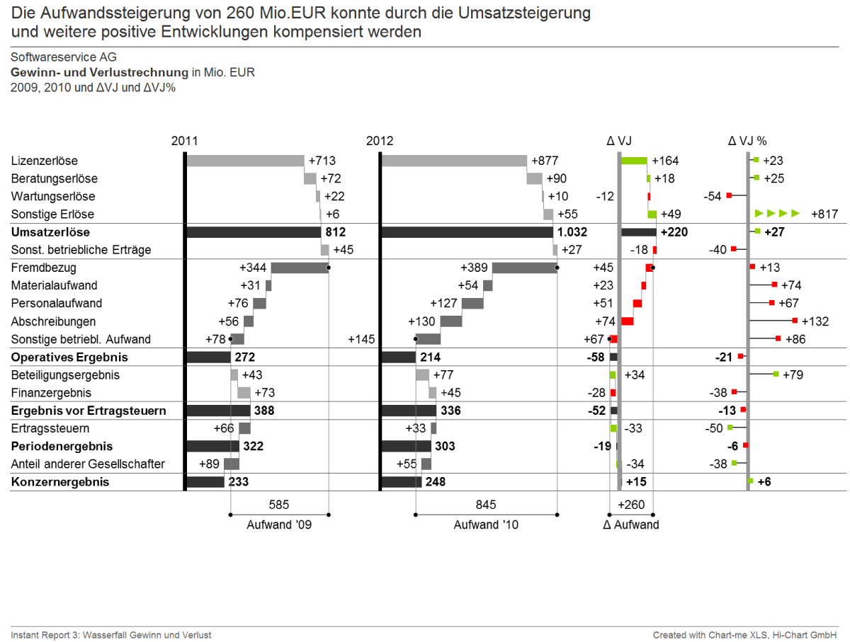
The structure of the income and expenses is shown here at a glance.
In addition, the variances are shown in absolute and percentage terms. This overview is more and more frequent in reports. The same representation is also suitable for the visualization of contribution margin accounting or a cash flow.
……………………..

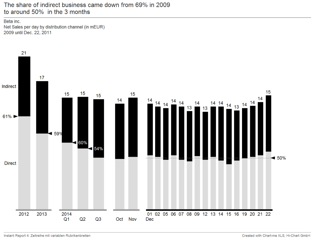
Here, a time series with different periods is displayed in different column widths.
The more an event in the past, the less interesting are details. Shown here are stock quantities or quantities that are normalized to the time, such as the cumulative monthly average. In this chart, the column widths can be set as desired: Either in periods such as years or months, or in pixels.
……………………..


Buy ready-to-use Excel template online and get started!
[hubspot type=form portal=19954785 id=18817a4c-075b-44a8-9f66-c4d595738f03]
 Twitter
 Xing
Xing YouTube