
Your personal Support Portal
Your personal Support Portal is available around the clock in the CP Customer Portal.
Here you can view your personal ticket history, submit support tickets, report urgent application-critical issues, search the knowledge base and make suggestions for the ongoing development of the hi-chart software.
Support portal: my.corporate-planning.com/cp
Introduction
demo video 5 minuts
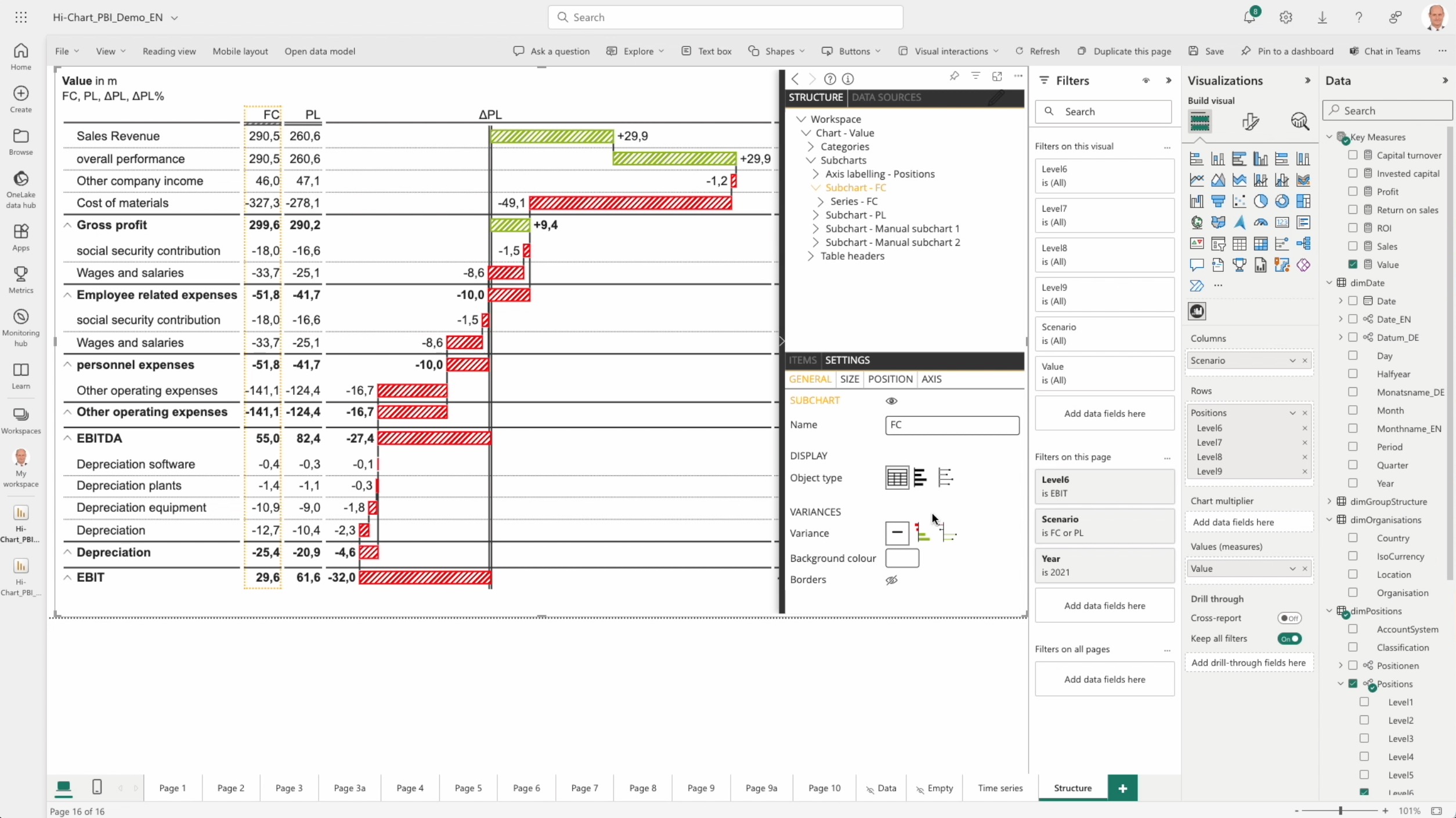
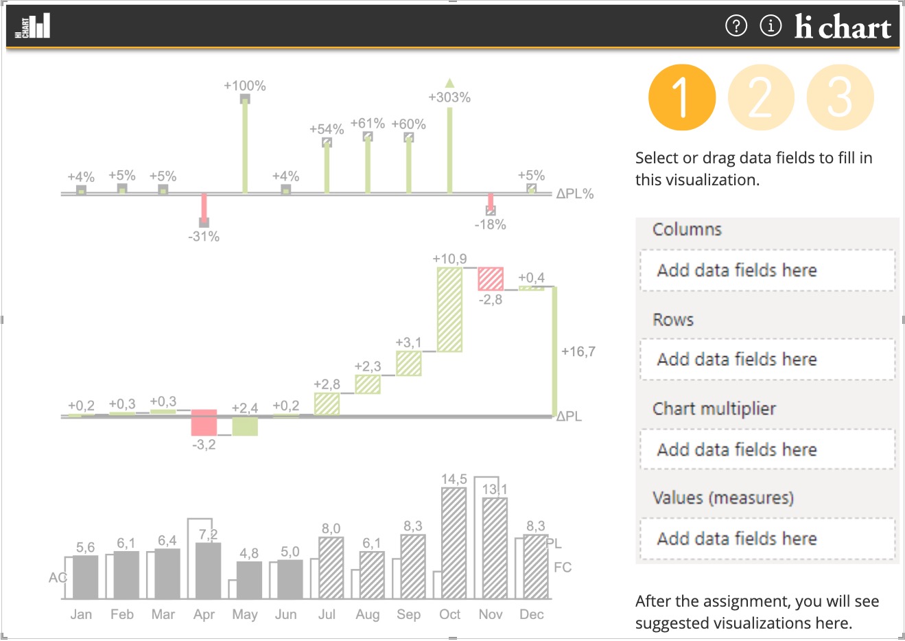
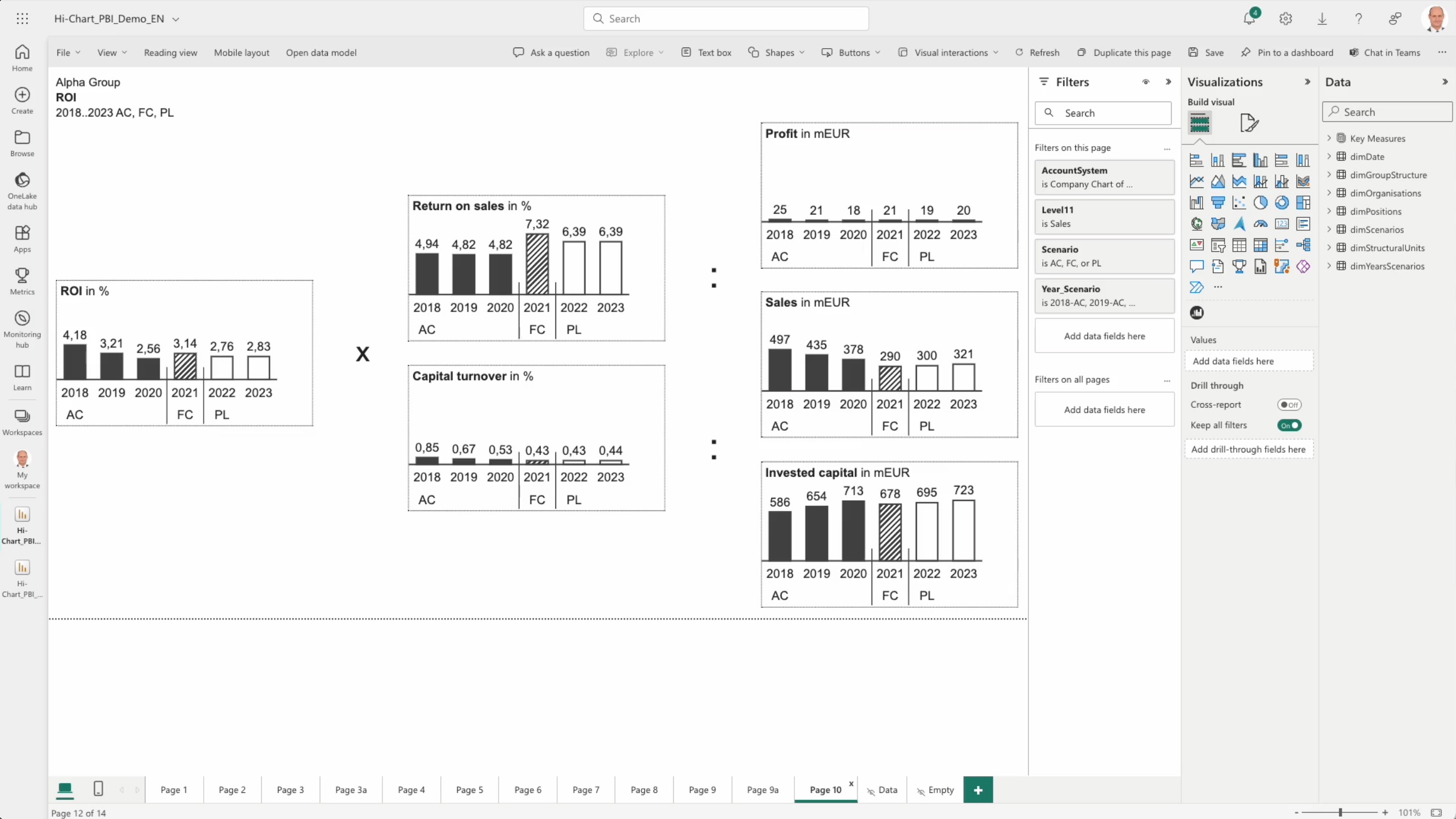
1. Assign the data
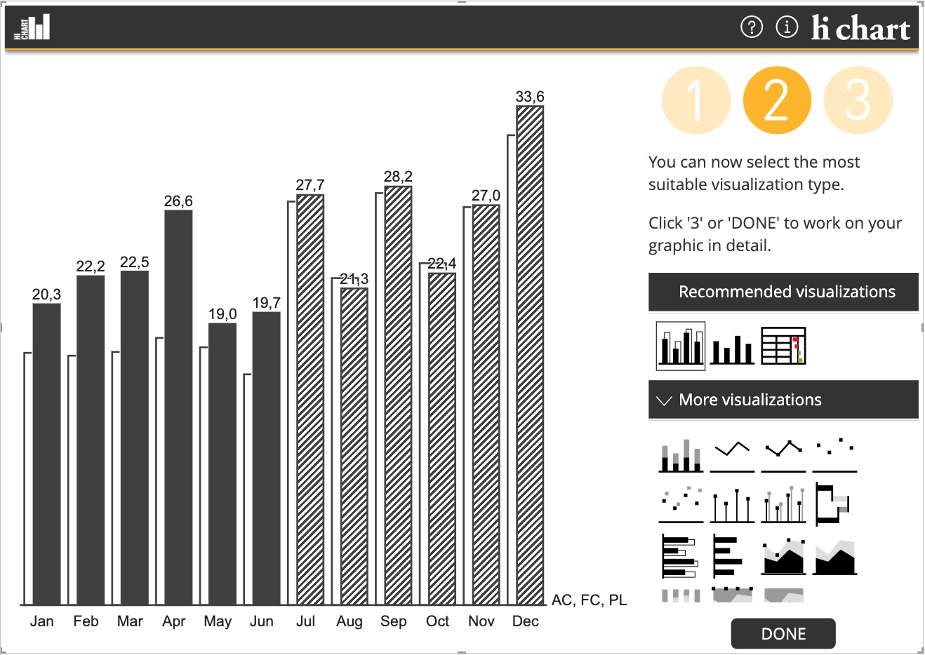
2. Choose a visualization
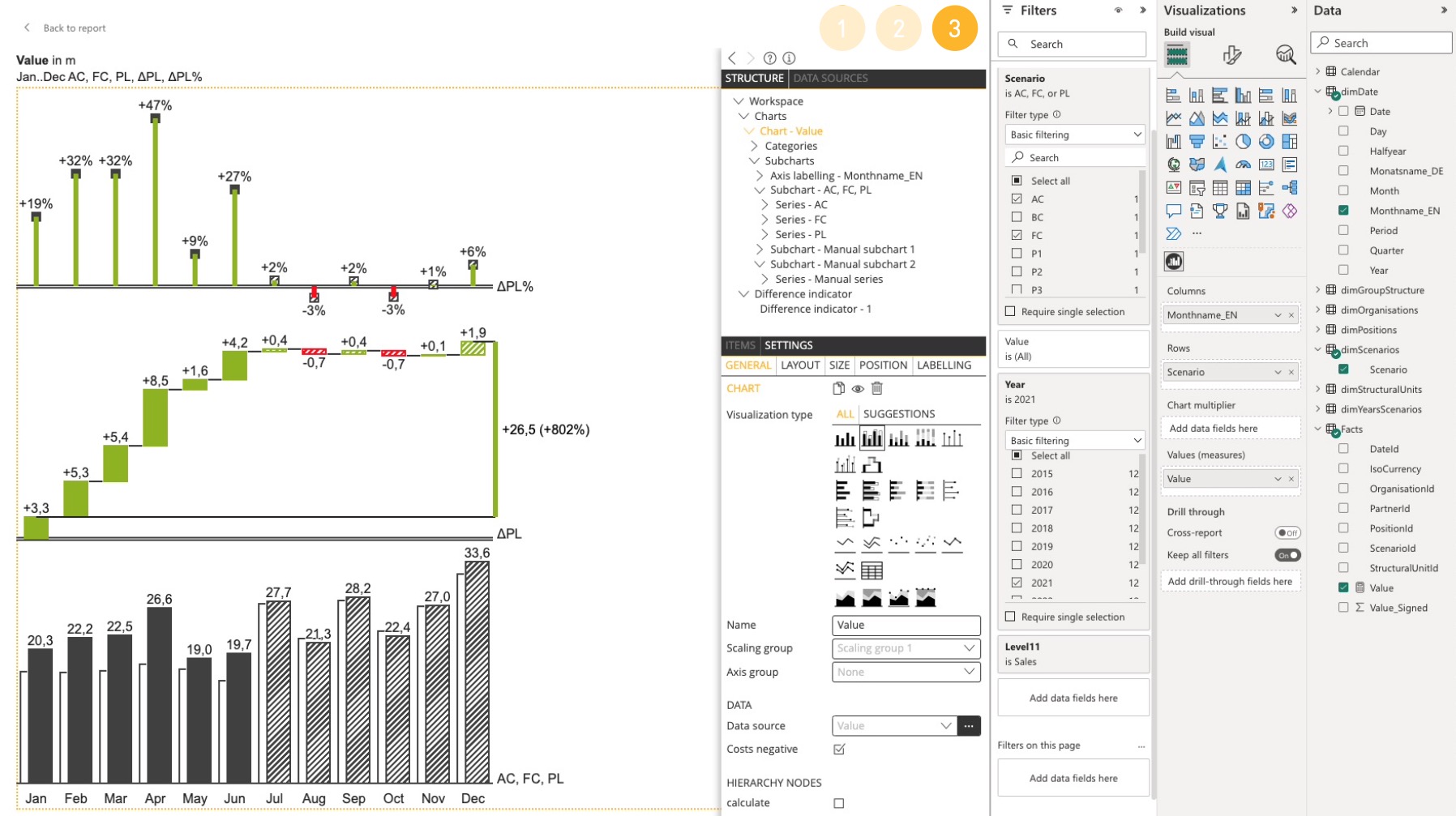
3. ADD VARIANCES AND HIGHLIGHTING – SIMPLY BY DRAG & DROP – AND THAT’S IT!
Documentation

more Videos
FAQ
Can an entered command be undone?
The undo redo function, which is operated with the two arrows, is located in the main menu on the upper left.
When is a normal and when a 100% stack chart is used?
A normal stack chart shows the summation of different values in data series.
A 100% stack chart shows the percentage distribution of different rows and the sum is 100%.
How to select a data point in a chart?
Click once on the corresponding data point.
How to select a row in a chart?
Click with the right mouse button on any data point of the category to be selected.
How to select a category in a chart?
Click with the right mouse button on any data point of the category to be selected.
How to change the order of table columns, data series, and sub charts?
Table columns as well as variance charts are sub charts and can be moved in the structure view using drag & drop. For a better overview it is recommended to move the sub charts in the collapsed state.
How to change the display order in the stacked or grouped time series chart?
Select the series to be moved in the structure view and drag and drop it to the desired position.
Where can the different colorings of the columns or bars be set if they are not controlled by the property AC, PL or FC?
These settings are specified by the selected stylesheet. Changes to the stylesheet can only be made by an administrator.
The title label (in Chart – Settings Labelling) protrudes into the display area of the chart / table shown below. How can you proceed here to allow a distance between the labelling and the chart?
These labels are on a fixed position on the page. In order to allow a distance between the title and charts or tables, you can adjust the margins and paddings under Chart – Settings – Position.
How can you make differently sized charts to be displayed on a report page as commonly scaled?
The report page is designed in a way that the displayed objects optimally use the available space. Thus, different value measures are displayed with the same size. To display two or more objects in the same scale, they must be assigned to the same scaling group. The settings are made for the chart in Settings – General.
Download Examples + Data
Test data
 Twitter
 Xing
Xing YouTube