hi-chart Reporting Studio for Power BI

is a data-driven reporting solution for Power BI

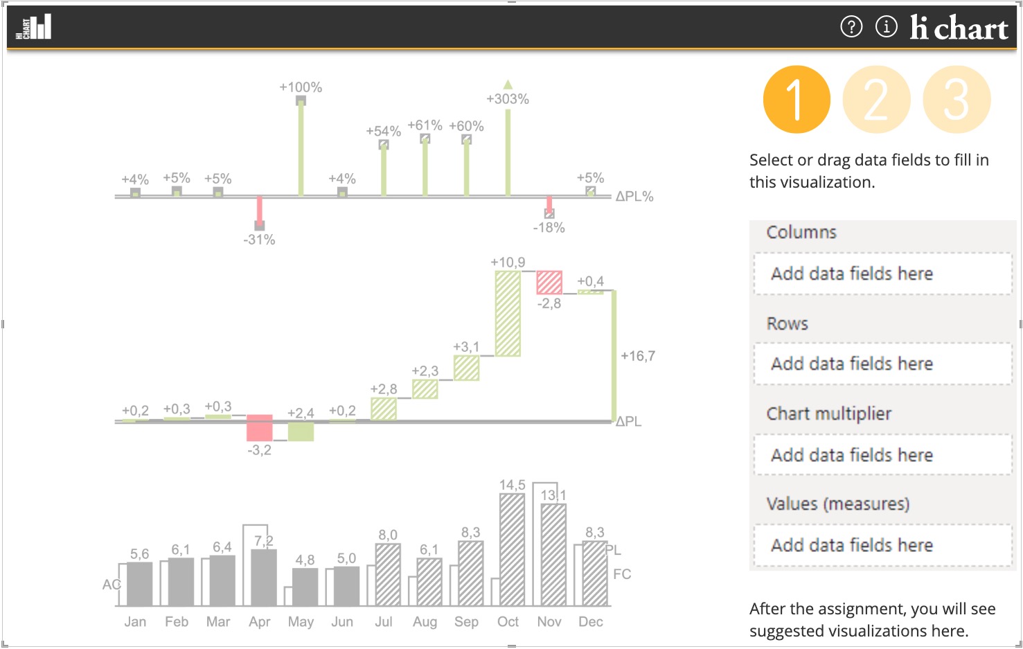
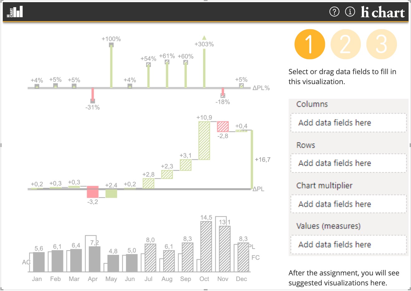
Creating uniform graphics with a notation concept in Power BI for your reports and dashboards has never been easier.
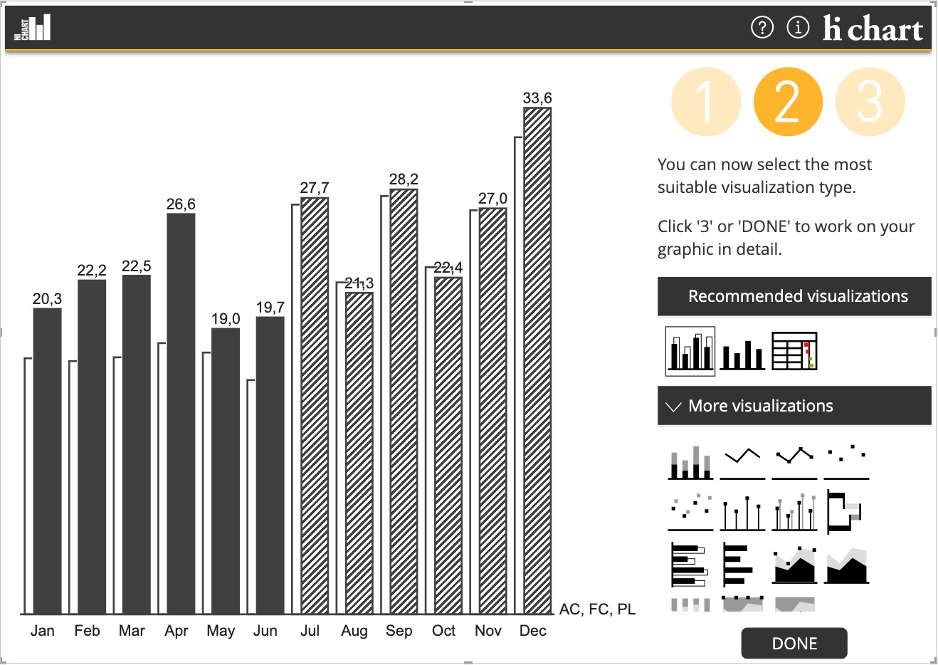
The automatic recognition of the business significance of your data ensures that you are immediately offered suitable suggestions for visualization.
The IBCS notation concept is already built in.
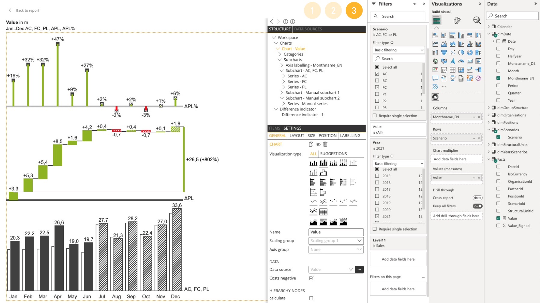
The graphics come with sensible object settings and can also be adapted to suit almost all requirements.

Reporting Studio is IBCS® certified.

and this is how it’s done:

1. Assign the data

2. Choose a visualization

3. ADD VARIANCES AND HIGHLIGHTING – SIMPLY BY DRAG & DROP – AND THAT’S IT!

Introduction video

video
play-sharp-fill

Highlights

  • Automatic one-click visualization suggestions according to the IBCS notation concept. On the basis of an analysis of the data from a business point of view, the Reporting Studio library immediately and automatically suggests the best visualization options for the selected data. Alternatively, other visualizations can be selected from the extensive Reporting Studio library.
  • Headlines are generated automatically according to IBCS® notation. From the analysis of the same data, the headlines are composed automatically according to IBCS® notation.
  • All visualization objects can be inserted by drag & drop. All objects in the Reporting Studio library can be easily and intuitively inserted by drag & drop.
  • Charts and tables can be converted into one another and generically supplemented with any number of subcharts. Charts and tables are equivalent chart objects in the Reporting Studio library, so they can be converted into one another as desired. They can each be supplemented manually with any number of subcharts.
  • The structure of data series and table columns is data driven. The initial data link for data series can be adjusted and assigned individually.
  • Tables can also be supplemented with charts as variance columns entirely as desired. Variances are essential for comparing data. With Reporting Studio, variance columns can be displayed as bars within tables or, in the case of hierarchies, as a waterfall.
  • The variances can optionally be calculated by hi-chart. If no data for calculated variances are available, Reporting Studio can calculate the variances itself. To allow this, the designer can insert a variance manually from the Reporting Studio library. The variance calculation can be defined as desired.
  • Waterfalls are created along hierarchies fully automatically, and the effects of income and expenditure can be differentiated by entering total effects. Waterfalls are suggested for visualizations based on hierarchically structured data. Positive or negative effects on the total can be defined.
  • All objects, such as charts, subcharts, series, categories, data points, highlighting, etc. are clearly displayed in a structure tree, where they can also be selected.The designer is provided with a clear display of all the objects on the report page in the form of a hierarchically structured tree. As well as selecting the elements directly, any object can be selected in the structure tree for its settings to be adjusted. In the structure tree, objects can be moved within their hierarchy level to change the order in which they are displayed.
  • To obtain perfectly formatted displays immediately, all objects come with sensible default settings. All elements have a large number of individually adjustable settings. All settings are defined as close to the top of the structure tree as possible and passed down to the lowest available element. This means that the settings for objects that should look the same, for instance, on the whole page, need only be defined once. The settings are then passed down as far as possible, e.g. to the individual data point. The inherited setting can of course be overwritten at any point in the structure tree.
  • The Reporting Studio object size concept always ensures perfect proportions between chart objects and their labels. For perfectly proportioned visualizations every time, regardless of the space available, the Reporting Studio object size concept has been developed. With automatically interlinked default settings, this makes sure that the proportions between all chart objects, labelling, comments and other highlighting, as well as all spacing, are always correct.
  • In the data manager, a Reporting Studio wizard, the data are displayed multidimensionally. Dimensions are automatically classified according to business significance, in terms of time, scenarios (streams), calculation path and key figures. The Reporting Studio data manager shows the selected data in a multidimensional display in which the dimensions are arranged in rows, columns and filters. The designer can change this assignment as desired. Multiple time dimensions, a “supplementary scenario”, and the stock or flow value KPI type along with its unit can be assigned. The designer can already see the suggested visualizations for the current data configuration in the data manager. In the downstream dimension editor, all dimension elements can be individually classified, re-sorted and filtered.
    A demo data source for each chart type is also included so that charts can be inserted if a user-defined data source is not yet available.
  • Actual data are automatically supplemented with forecasts or plans. In a reporting period, the actual data are normally available up to the current month. To produce informative graphics and to display variances from forecast or planned values, Reporting Studio automatically includes existing forecast or planned data within the actual data series.
  • Excel connection – Excel and CSV files can be imported to Reporting Studio as additional data sources in all extensions.
  • Custom notation concept – Custom display styles, stylesheets, can be defined for use across all projects in a wizard. This makes it possible to define and update a central notation concept with logos, colours, line widths, point sizes, fonts, etc.
  • High-resolution print-ready exportshi-chart delivers its exports in extremely high quality. PowerPoints can be projected onto large screens without individual pixels being visible. The PDF or PNG output is also immediately ready to print.

Graphic Objects and Highlighting

Basic chart types

  • Unstacked columns and bars
  • Stacked columns and bars
  • 100% stacks
  • Waterfalls
  • Point and line charts
  • Area charts for stacked point-lines
  • Tables
  • Multicharts

Highlighting and Controls

  • Comments (comment reference and external comment text)
  • Value indicator (highlights a value in the graphic) 
  • Difference indicator (highlights the difference between two values)
  • Scaling indicator (highlights scaling differences between multiple charts)
  • Text box as html box to display static text, images and other multimedia content

Variance chart types

  • Columns and bars for simple delta variances
  • Waterfall columns and bars for cumulative variances
  • Needle chart type for percentage variances

Power BI Integration

  • The hi-chart Reporting Studio Power BI custom visual is fully integrated in Microsoft Power BI.

  • Power BI functions, such as filtering, cross-filtering and cross-highlighting, are available.

  • The hi-chart Reporting Studio Power BI visuals can be exported to PowerPoint presentation and PDF formats with the standard Power BI functionality.
  • hi-chart Reporting Studio for Power BI is available across the entire Power BI platform, including Power BI Desktop, Power BI Service (Cloud), Power BI Report Server, Power Bi Mobile Apps (IOS & Android), Power BI Embedded and publish to web. 
  • All settings made by the user in the hi-chart Reporting Studio visual are saved in the parent Power BI project along with the visual itself.
  • The languages supported by the hi-chart Reporting Studio custom visual are English, German, Spanish, French, Italian, Dutch, Portuguese, Russian, Serbian and Chinese.
  • The hi-chart Reporting Studio custom visual is licensed and delivered via Microsoft AppSource or with a separate licence key.
  • hi-chart Reporting Studio for Power BI is certified by Microsoft

hi-chart Reporting Studio for Power BI