Chart-me XLS in detail
For consistent, clear and compelling management reports, dashboards, and presentations

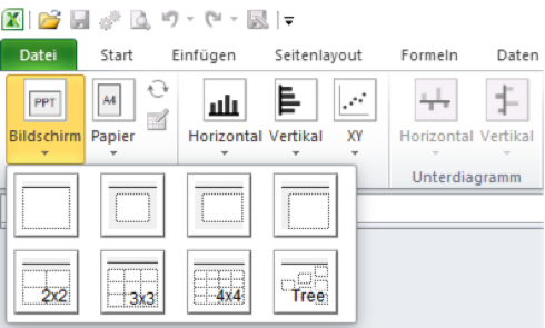
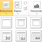
Whether you want to use your charts for PowerPoint presentations, on the screen, for printouts or print previews:
Chart-me XLS offers layout templates for any purpose, with which you can either present single charts or present multiple charts at the same time. The layouts can, of course, be changed at any time, for example when a new purpose is used.
By the way, the creation of charts for PowerPoint is especially comfortable as our layouts fit pixel-accurate into PowerPoint slides.
Next, simply select the desired charts and insert them into the layout.
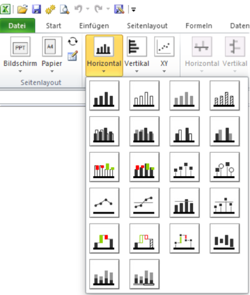
Depending on the HICHERT®SUCCESS concept, the predefined chart types are divided into three groups:
All predefined types can also be configured in every detail and can also be combined (superimposed). As a result, nearly every design wish can be fulfilled.
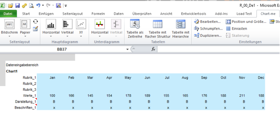
Now you connect your charts with the desired data.
For this, you can simply paste the corresponding values into the Excel file created with Chart-me XLS.
Alternatively, a dynamic connection to data sources is also possible.
This keeps important charts and tables up-to-date.
For meaningful business reports, tables are just as important as charts. And when both speak the same language, the comprehension for the report recipients is particularly simple.
The operation is performed in the usual manner via Excel cells. You can simply enter values here or link them from almost any data source.
Chart-me XLS version 2 was released in early April 2015 and contains the table module.


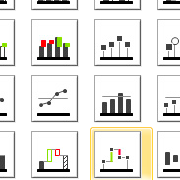
Chart-me XLS provides you with 47 predefined main charts (columns, bars, lines, needles, points, waterfall, bubbles, bubblepie).
In addition, you have the choice between a further 34 predefined variance charts (columns, bars, needles, waterfall).
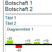
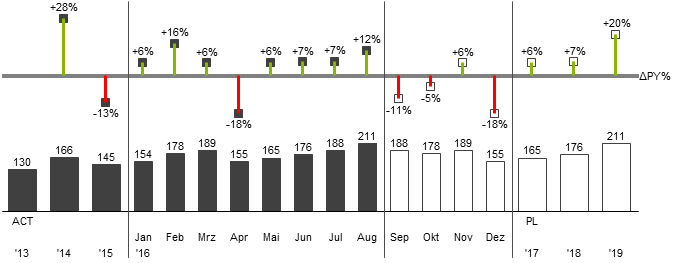
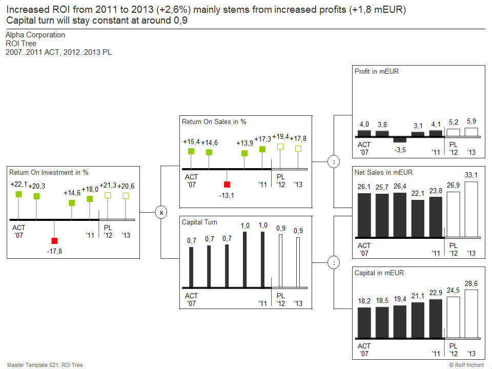
Cumulated variance
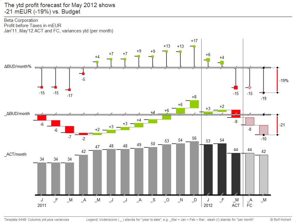
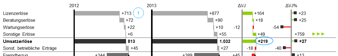
Profit and loss statement

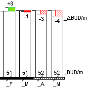
In the lower part, the basic values for Actual, Plan, Forecast and Previous Year are shown.
In the representation of the accumulated variance (year to date) in the upper part, it is important to concatenate the variances of the individual months in the form of a waterfall.
The distance from the zero line represents the cumulative deviation. It is visualized to the right by a difference indicator.
The structure of the income and expenses is shown here at a glance. In addition, the variances are shown in absolute and percentage terms.
This overview is more and more frequent in reports.
The charts are embedded in a page layout that fits pixel-accurate on a PowerPoint slide.
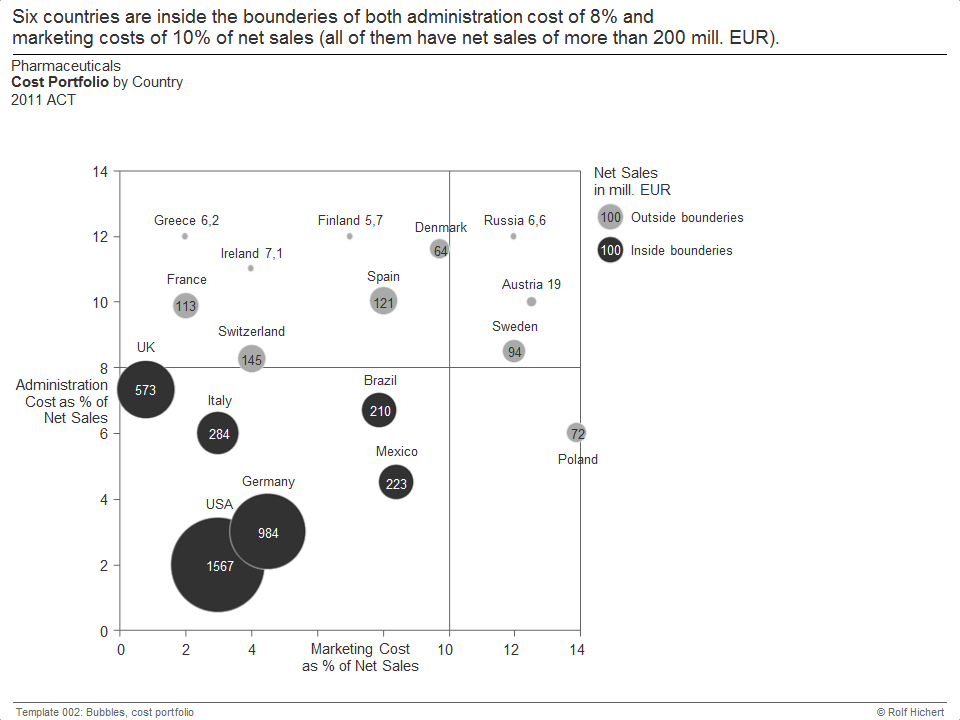
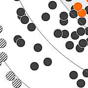
The portfolio shows the relationship between marketing and administration costs in various subsidiaries of a group.
The bubbles can have different formatting and labeling.
The portfolio area can be segmented as desired.
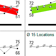
In this key figure tree, each value type is represented by its own chart type. Millions of euros are different than key figures in percent and multiple key figures.
All charts are embedded in a suitable page layout.
All important parameters, such as scaling, labeling or scenarios, can be dynamically controlled.
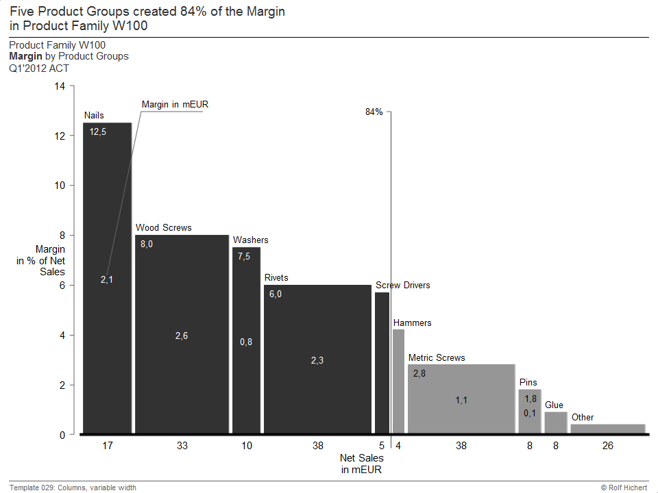
The contribution margin for products is displayed in this chart as the area size.
The height of the columns corresponds to the margin, the width of the turnover. Both sizes are multiplied and yield the column area.
The variable column width was used for the implementation with Chart-me XLS.
Ad hoc analyzes are now an indispensable part of reporting and controlling.
Therefore, convincing charts for ad-hoc analyzes are no longer a “nice-to-have”, but an important tool for managers and decision-makers.
As a rule, very specific questions are to be answered in ad-hoc analyzes.
A convincing visualization of these responses is a major challenge for controllers. Microsoft Excel does not offer any convincing tools to create effective business charts quickly and efficiently, regardless of the data source.
Not for nothing, charts for ad-hoc analyzes are often drawn by hand in PowerPoint.
Chart-me XLS solves this problem quite simply.
Chart-me XLS provides you with a solution that allows you to visualize ad hoc analyzes efficiently and convincingly. Because Chart-me XLS offers you not only a large number of chart types, which meet all applications.
Intelligent workflows, easy-to-understand wizards and dialogs as well as comprehensive customization options allow you to create business charts with just a few clicks, making your ad-hoc analyzes a real decision-making aid.
With Chart-me XLS, you can also easily combine different chart types to scale. In this way, central messages of their ad-hoc analyzes can be conveyed particularly clearly.
Chart-me XLS offers numerous layout templates for your business graphics.
Not only are there many formats available that you can insert pixel-accurate into PowerPoint presentations.
The exact output for the printing is likewise quite simply possible.
If you change the output format, of course, nothing is lost – your charts are automatically adjusted.
Chart-me XLS puts you in the position to create convincing graphics for ad-hoc analyzes in the shortest possible time.
Through the consistent and always scale-oriented presentation concept of Chart-me XLS, you also establish a consistent picture language in the reporting of your company – for all types of reports.
Controller, managers and decision-makers can fully focus by the clear and unambiguous representation to the essentials: The content of the ad hoc analysis.
By the way: When you introduce Chart-me XLS to the design of routinereports, perfect graphics for ad-hoc analyzes are later a resource-saving additional product.
A professional, functioning reporting system is a key success factor for companies. Because good reporting provides management with all the information needed to manage a company and make the right decisions. Business charts are of particular importance: They make relations quickly visible, facilitate comparisons and make clear developments much more catchy than pure texts or number tables. The prerequisite for this is, however, that the Business Chart follows clear and uniform presentation principles.
The most used software in reporting is still Microsoft Excel – even if ERP systems such as SAP, proAlpha or MS Dynamics are used in the company.
As powerful and functional as Excel is today – the on board equipment of visualizing business figures are generally not enough to provide business reports with well-legible and consistent charts. Theoretically, this is conceivable, but in practice it is much too time-intensive.
Visualization in reports therefore too often spoils their potential as important knowledge and decision-making aid and are hardly more than decoration. Reports often have conceptual deficiencies. Be it because no clear questions are formulated or not sufficiently focused on the information needs of the receivers.
In reporting, it is therefore generally helpful to establish clear communication rules. This helps to create meaningful and easy to read annual reports. SUCCESS@IBCS, one of the most successful and widely used concepts, is the principle of Chart-me XLS.
Chart-me XLS eliminates the limitations of MS Excel as a visualization tool and turns it into a professional software for creating compelling business charts within minutes. Chart-me XLS has been developed specifically for reporting and enables visualizations that meet the requirements of large corporations – at a price that is also attractive for small companies.
PowerPoint presentations are an important medium in controlling and reporting. More than in reports that are produced for reading, presentations should always show clear intentions and content. The slides, which are shown in a presentation, are not the focus, but rather they accompany and support the presenter in his statements. Visualizations such as figures, charts and tables are therefore of paramount importance.
Correctly implemented and used visualizations are expressed, which can only be formulated verbally. They offer starting points for argumentations and explanations or impressively demonstrate what has been said. In reporting, “correct” means primarily: clear, uniform, condensed – and with a clear reference to the message of the presenter.
With Microsoft Excel alone, charts and figures that meet this need can only be created with considerable effort or not at all. The reasons for this are diverse:
Although Microsoft Excel is not designed to efficiently produce professional chart slides for PowerPoint. With Chart-me XLS, however, this standard software in reporting and controlling can be easily expanded. In this way, you receive a business chart tool which has also been specially designed for the design of PowerPoint presentations. The advantages of Chart-me XLS at a glance:
Chart-me XLS also offers you many additional chart and presentation possibilities, which have proven themselves in controlling and reporting. These include waterfall and needle charts, charts with variable column or bar width, as well as column and bar charts with integrated variances. Of course, separated variances or bubble pie charts are also possible.
With Chart-me XLS, all functions and chart types that you have previously missed are available directly in Excel. The generated report pages can also be used by PowerPoint and Excel users who have not installed Chart-me XLS.
See here how easy to create report pages with Chart-me XLS for PowerPoint presentations is.
ERP systems such as SAP, Microsoft Dynamics, proAlpha and Oracle provide companies with detailed business figures at the push of a button. Companies that also rely on Business Intelligence (BI) receive data that has already been prepared. But as important as ERP systems and business intelligence including data warehouses, OLAP and data mining are today: Professional business charts that follow a clear logic can often only be created with these tools.
The reasons for this are different: Many ERP systems and BI tools are simply not designed to generate professional business graphics for reporting purposes. If they are, the use often requires a great deal of processing and implementation. Also a very inhomogeneous software landscape, not only in the market as a whole, but also in the respective company, contributes to the fact that data can not be clearly and uniformly visualized.
Most ERP or BI systems have an export function for Microsoft Excel. With Chart-me XLS, you can easily create uniform charts and report pages based on data from ERP or BI systems. Even numbers that come from different systems can easily be merged into Excel and convincingly visualized with Chart-me XLS. The generated charts or report pages fit pixel-accurate into PowerPoint slides or are output format-compatible for printed reports. The graphics are simply stored as Excel files and can be used at any time without Chart-me XLS.
With Chart-me XLS, the advantages of ERP or BI systems can be used even better. Not only because the workflow is simplified during visualization. By the presentation principles, the Chart-me XLS on the basis, you can also create the basis for a uniform and clear picture language. At the end there are business charts and reports, which are convincing in every respect and immediately understandable for all parties involved.
Advantages of Chart-me XLS in combination with ERP / BI systems at a glance:
Chart-me XLS is programmed for everyday reporting. This means that you can easily create complete report pages – accurate for PowerPoint and (printed) reports. In addition, there are many additional chart types as well as combination possibilities, which bring important advantages in the reporting practice. Your business charts or Excel files can also be used without Chart-me XLS. And ultimately, not only is it cost-effective, but also does not incur any costs for implementation and maintenance.
Test now !
[hubspot type=form portal=19954785 id=18817a4c-075b-44a8-9f66-c4d595738f03]
 Twitter
 Xing
Xing YouTube