
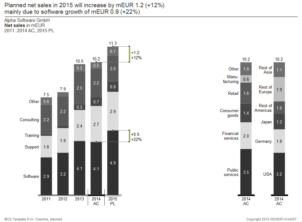
1a. 5 years, comparison of different structures
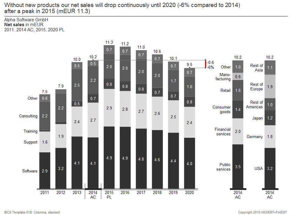
1b. 10 years, comparison of different structures
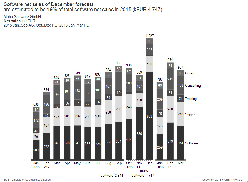
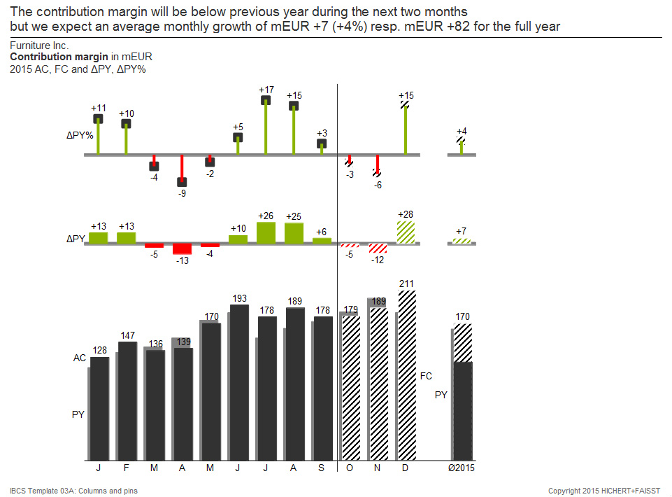
1c. 15 months, AC, FC, PL in a structure
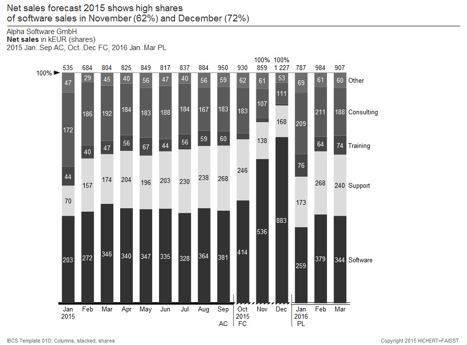
1d. 15 months, AC, FC, PL as 100% stack
1e. Time series with different periods: years, quarters, months, days
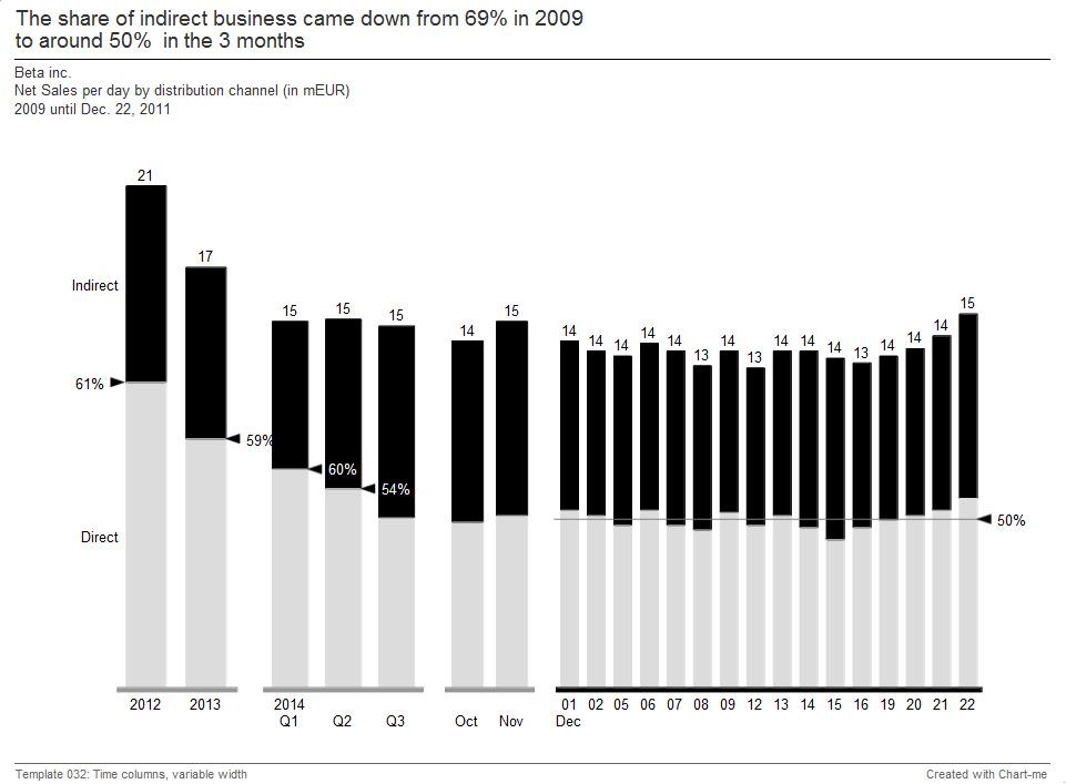
Stacked column charts are used for many analyzes in practice for the display of data in their temporal development. These types of charts are best suited when no more than five or six series of data are displayed with small changes within a data series for no more than 25 time periods. Disadvantages of this chart type are: If at all, negative and positive values can only be displayed in the lower data series. The temporal development is only clearly visible in the lower data series and in the sum. If data points are missing, the label is problematic and the analysis is difficult.
Important: Correct scaling of the charts with the same units (values, volume, proportions, ratios); Integrated legends on the left or right side of the respective values; Data labels inside the column elements when there is enough space and hidden data labels if there is not enough space; Totals outside at the end of the columns; Consistent title and footnote concept; Usage of the axis line for meaning (“semantic axes”).
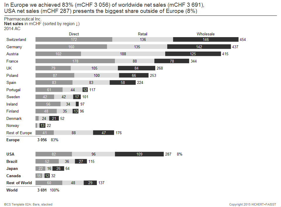
2. Stacked bar charts for totals over structures
2a. Structure, 100% stack
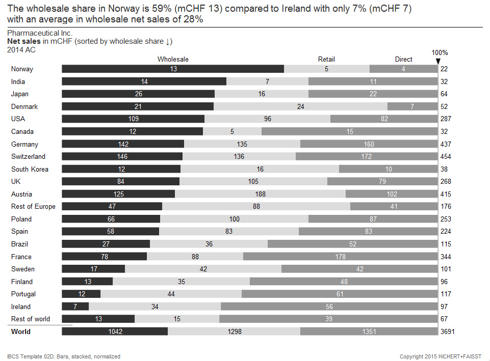
2b. Structure, sorted and stacked
2c. Structure, sorted and stacked
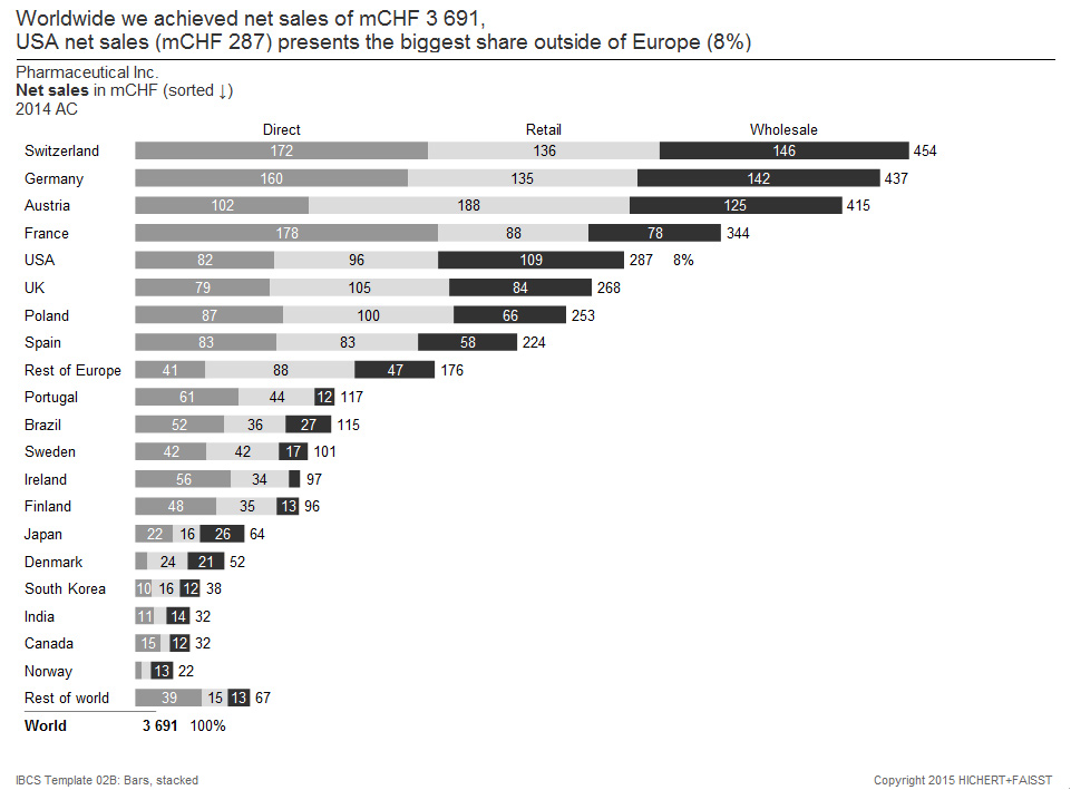
Stacked bar charts are used for many analyzes in practice to display data in a given period of time or at a particular time. These types of charts are most useful when no more than five or six series of data are represented for no more than 25 structural elements. Disadvantages of this chart type are: If at all, negative and positive values can only be displayed in the first (left) data series. The structure is easy to read only for the first (left) data series and for the totals. If data points are missing, the labelling is problematic and the analysis is difficult.
Important is: Correct scaling; Integrated legends at the top or bottom of the bar data points; Totals outside the bars; Consistent title and footnote concept.
3a. Grouped with absolute and relative variances
3b. Grouped with absolute variances

In the first tier, this kind of chart compares different scenarios in a grouped column chart. The second and third tier show absolute and relative variance charts. For example, this 3-tier chart can be used to analyze the time development of different scenarios. This chart works best for comparing two scenarios for no more than 25 time periods. If a third scenario has to be presented, triangles can also be used in the appropriate notation.
Important: Correct scaling of the charts with the same units (values, volume, proportions, ratios); Legends on the left or right side of the data series; Value labels above or below the visualization elements; Red and green variances; Needles for relative variances, columns for absolute variances; Notation concept for columns showing different scenarios; Consistent title and footnote concept.
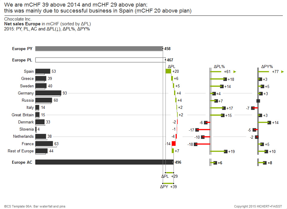
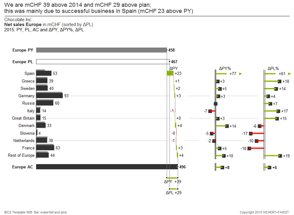
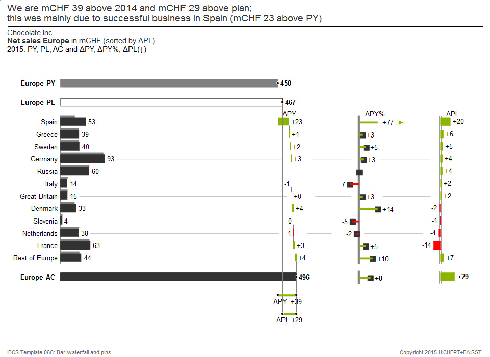
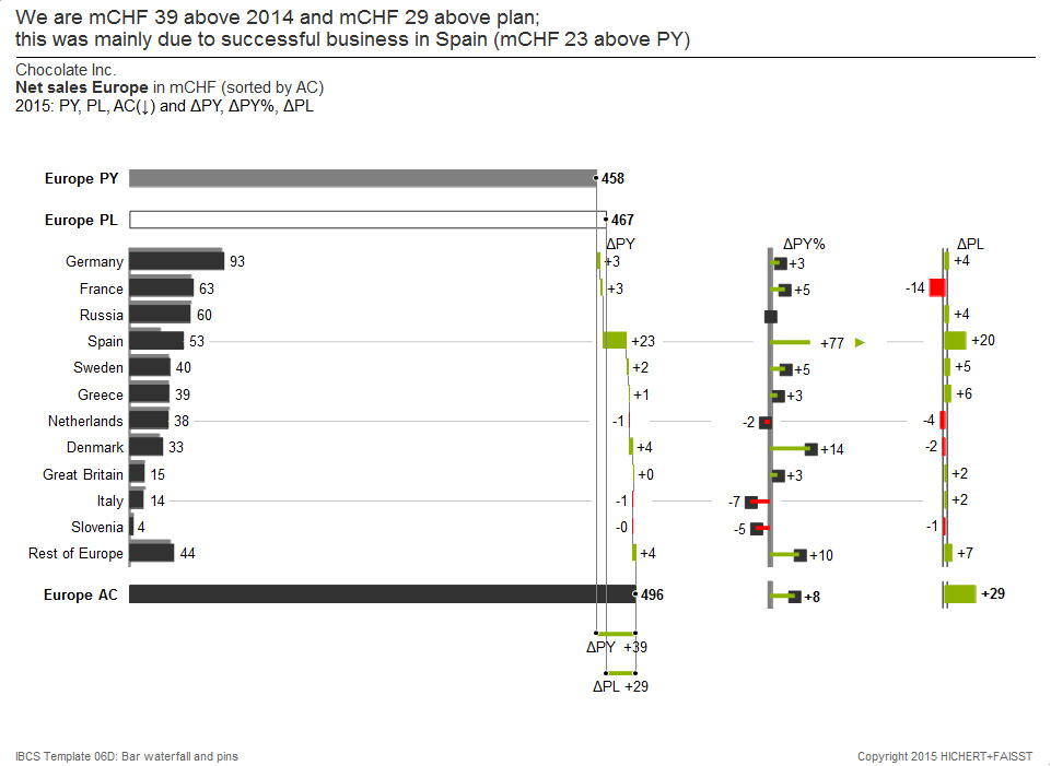
4. Multi-tier bar charts for structures with scenario comparisons
4a. Grouped, sorted by ΔPL

4b. Grouped, sorted by ΔPL%

4c. Grouped, sorted by AC

4d. Grouped, sorted by PL
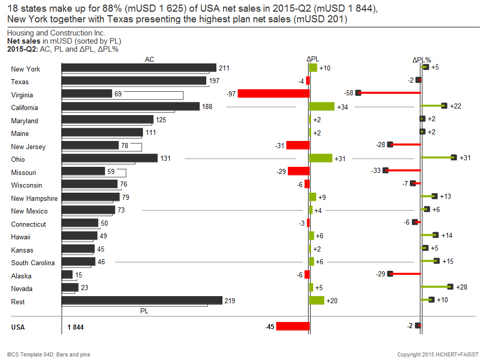
The first tier compares different scenarios in a grouped bar chart. The second and third tiers show different absolute and relative variance charts. For example, this 3-tier chart can be used to analyze the data structure of different scenarios. This type of chart works best when two scenarios are presented for no more than 25 structural elements. If a third scenario has to be presented, triangles can also be used in the appropriate notation.
Important: Correct scaling of the chart with the same units (values, volume, proportions, ratios); Legends above or below the respective data series; Value labels on the right or left side of the visualization elements; green deviations; Needles for relative deviations, bars for absolute deviations; Notation concept for bars showing different scenarios; Consistent title and footnote concept.
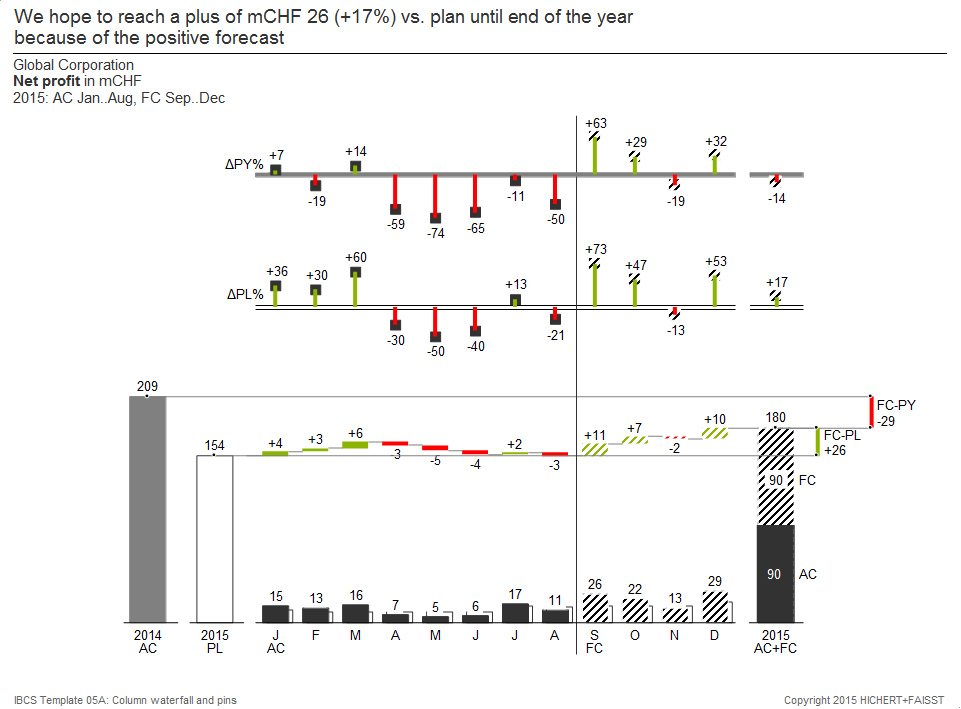
5a. Grouped, waterfall, 2 x relative variances
5b. Grouped, waterfall, an absolute and a relative variance
The lower tier of this chart shows columns for AC (or FC) grouped with PL 2013 combined with a horizontal waterfall showing the absolute variances. It is expanded by an additional column for AC 2012 (= PY). Two further series show the relative variances to PL and PY, optionally absolute or relative (in percent). This chart type can best be used when two scenarios are displayed for no more than 25 time periods. If a third scenario has to be presented, triangles can also be used in the appropriate notation.
Important: Correct scaling of the charts with the same unit (values, volume, proportions, ratios); Legends on the left or right hand of the data series; At the top or bottom of the visualization elements; Red and green variances; Needles for relative variances, columns for absolute variances; Notation concept for columns showing different scenarios; Consistent title and footnote concept.
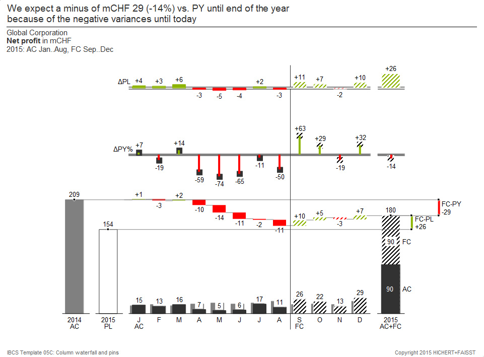
6. Vertical bar waterfalls for summation along a structure
6a. Grouped, waterfall, deviations
6b. Grouped, waterfall, deviations
6c. Grouped, waterfall, deviations
6d. Grouped, waterfall, deviations
The left-hand tier of this template shows bars for AC and PL grouped with a vertical waterfall representing the absolute variances. This representation is sorted by the absolute variances to PL and is extended by an additional bar for PY. Two further series show the relative variances to PL and PY. This template works best when two scenarios are presented for no more than 25 structural elements.
Important: Correct scaling of the charts with the same unit (values, volume, proportions, ratios); Legends above or below the chart elements; Value labels on the left or right side of the display elements; Red and green variances; Needles for percentage variances, bars for absolute variances; Notation concept for bars showing different scenarios; Consistent title and footnote concept.
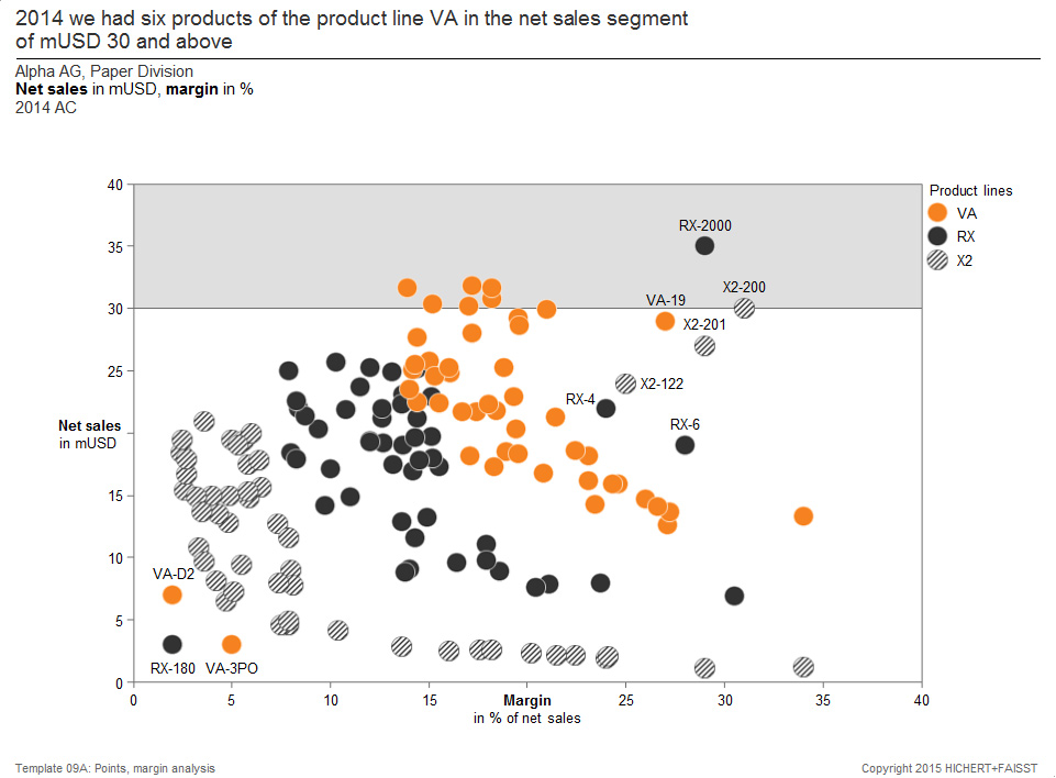
7a. Segmentation by net sales
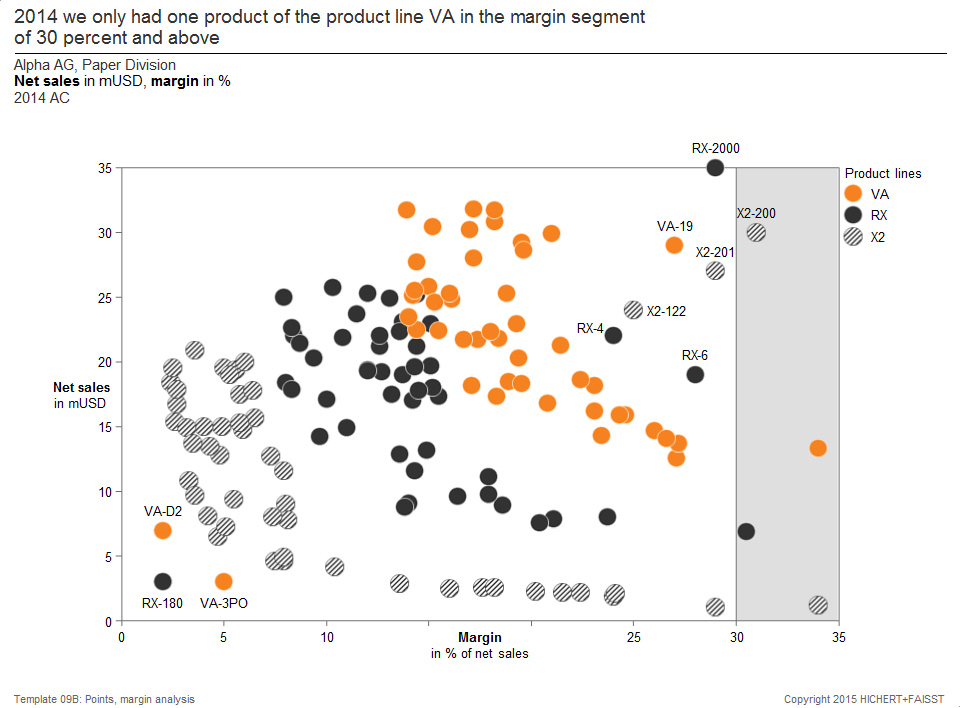
7b. Segmentation by margin
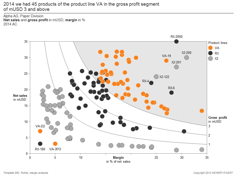
7c. Segmentation by gross profit
7d. Segmentation by gross profit
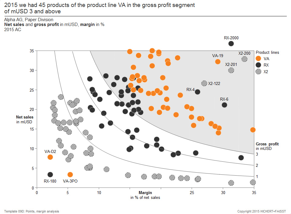
This figure represents data points in a chart with two value axes (here “Net sales” and “Margin”). The colors of the data points show the respective product lines.
Different variants arise here the segmentation of the XY plane.
7a: The area above a net profit threshold is highlighted in the chart
7b: The area above a margin threshold is highlighted in the chart
7c and 7d: The chart is subdivided by hyperbolic lines of equal “gross profit”. This type of chart can best be used if the two measures shown can be multiplied along a third dimension (here: the gross profit).
The number of data points can vary from a few to a few hundred or even a thousand.
Important: Legends inside or outside the chart to explain different colors or shapes; Selective labeling of data points; The labels are close to the data points; Consistent title and footnote concept.
8. Bubble charts in the XY plane with two value axes
8a. Bubbles
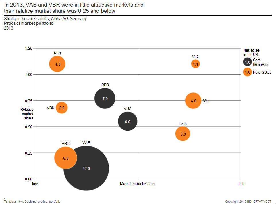
This template shows another example of a chart with two value axes: products are arranged as bubbles in a coordinate system of “market attractivity” and “relative market share”. The size of the bubbles corresponds to the “net sales” of the respective product. This template works best when the bubble position is defined by two independent (product) properties, and the bubble size by a third independent (product) property. The number of bubbles can vary from a few to a hundred or even more (depending on the bubble size).
Important: Legends inside or outside the chart illustrate different bubble colors or fill patterns as well as the meaning of the bubble size; Selective labeling of the bubbles; The labels are close to the data points; Consistent title and footnote concept.
9a. Tree structure

This template consists of six separate charts. In the column to the right, it shows the annual development of the basic values “return”, “net turnover” and “assets”. In the middle chart column, two ratios are calculated that lead to “Return on Assets” in the left column. This type of chart can best be used when the mathematical relationship between two or more measures must be displayed over time. The number of time periods can be from 2 or 3 to 8 or 15 in each chart.
Important: Correct scaling of the charts with the same units (values, volume, proportions, ratios); Notation concept for bars showing different scenarios; Consistent title and footnote concept.
10a. Two waterfalls, absolute deviation, relative deviation
10b. Two waterfalls, absolute cumulative and relative variance

On the left, this template shows two vertical waterfalls for a P & L statement. On the right side, two further planes show the absolute and relative variances of these two waterfall charts. This template works best when calculation schemas from different scenarios with their variances have to be displayed. The number of bars (computation steps) can be up to 20 or 25.
Important: Correct scaling of the charts with the same units (values, volume, proportions, ratios); Notation concept for bars showing different scenarios; Consistent title and footnote concept.
11a. Net profit over 15 charts and a highlighted chart with the average above all

11b. Net profit over 14 charts and average, a location with large values gets more space
11c. Net profit as absolute variance to the average over 14 charts, a location with large values gets more space
11d. Net profit as a relative variance from the average over 14 charts, a location with large values gets more space

The template 11c, for example, consists of “small multiples” for 16 locations and shows annual absolute variances from “net profit”. This template works best if one measure is to be multiplied along a further dimension (products, locations …). The number of “Small multiples” can be up to 25 or more, depending on the number of columns per chart and the font size.
Important: Correct scaling of all charts; Notation concept for columns showing different scenarios; Consistent title and footnote concept.
12a. Table with hierarchical rows and variance columns
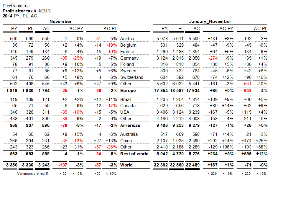
Template 12a. represents a key figure (result after tax) with a regional structure in rows and absolute and relative variances to previous year and plan in columns.
In this example, single-month and cumulative values are grouped with common centered headers to structure the two groups of seven columns each.
12b. Table with hierarchical lines and variance bars
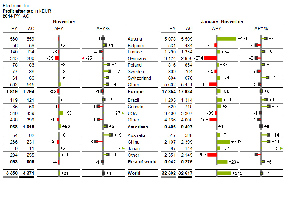
Template 12b. is based on the same data as template 12a.. Here the deviation columns have been replaced by bars and needles.
12c. Table with key figures in rows and scenarios in columns

Usually tables with key figures in rows are used for calculations such as profit and loss accounts.
In this example, the calculation scheme is displayed in the first column.
12d. Table with key figures in rows and scenarios in columns

Template 12d. is based on the same data as template 12c.. Here, the deviation columns have been replaced by waterfall bars and needles.
+ Bar for absolute variances (red = negative, green = positive)
+ Needles for percentage variances (red = negative, green = positive)
Excel – Templates
Ready-made solutions for MS-Excel
NEWSLETTER REGISTRATION
[hubspot type=form portal=19954785 id=18817a4c-075b-44a8-9f66-c4d595738f03]
 Twitter
 Xing
Xing YouTube